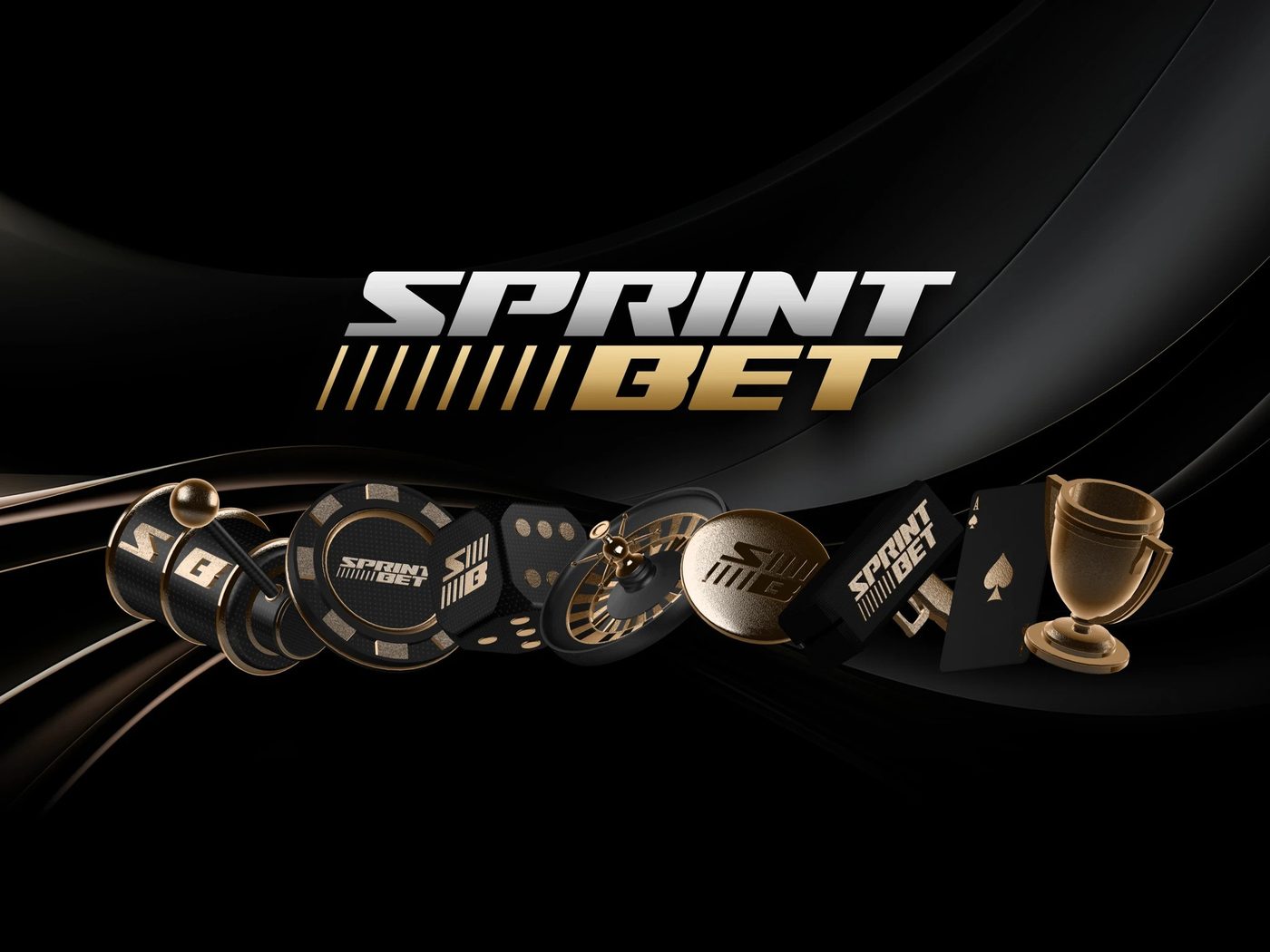
New brands launching
Identity, logo and visual language ready for product, marketing and growth from day one.
Branding service
A brand is what survives the first time a user sees it on a competitor screenshot. We design identities that hold up under that test.
Brand consistency
Slide from scattered to systemised and watch every touchpoint fall into line – along with recognition and revenue.
Illustrative model. Revenue impact anchored to research: companies with consistent branding grow revenue by up to 33% (Marq / PR Newswire) and design-led companies outgrow peers by +32pp (McKinsey). Actual lift varies by brand and market.
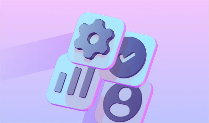
Anatomy of a brand
A mark that works at 16px and on a billboard. Primary lockup, monogram, horizontal and reversed variants, with clear-space and minimum-size rules.
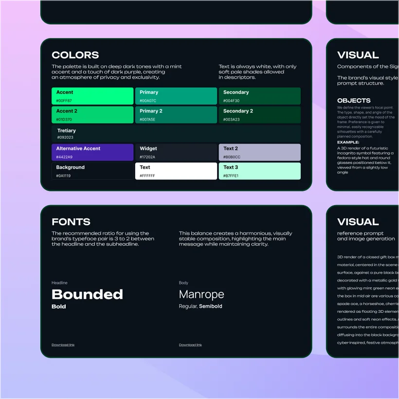
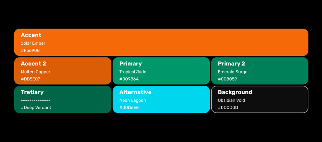
A palette with intent – core, accent and signal colours, full tint ramps, and accessible contrast pairings for light and dark.
A type system, not a single font – display and text families, a modular scale, and weights mapped to real UI roles.
A custom icon and illustration language so every surface feels like the same brand – consistent grid, stroke and corner radius.
How the brand sounds – tone of voice, messaging pillars, and do/don’t examples your whole team can follow.
“Design that survives the screenshot test.”
Built for your market
We design identities that respect how each market reads design – what signals quality, trust and ambition is not the same everywhere.
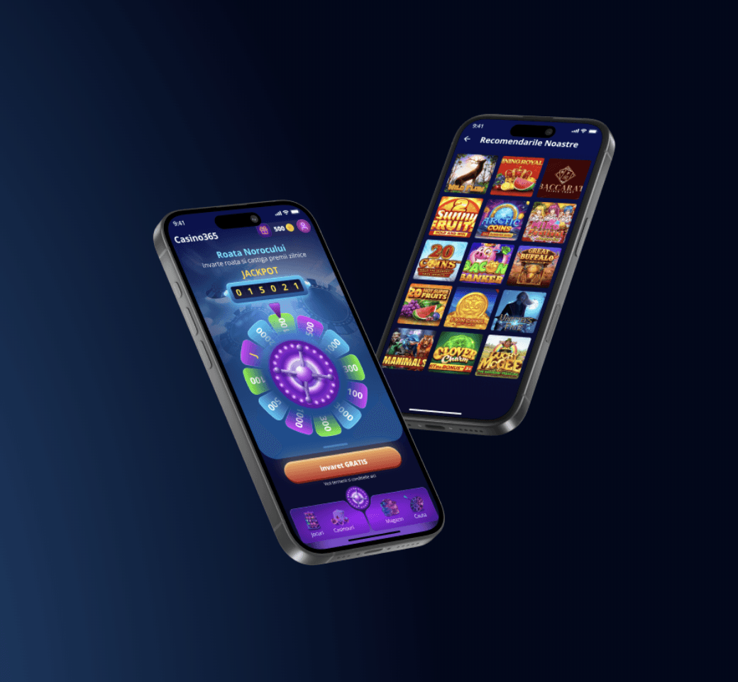
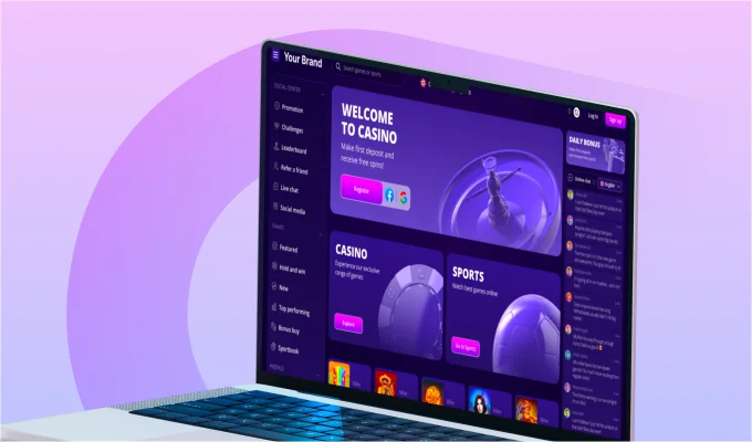
Applied everywhere
Who it's for
Identity, logo and visual language ready for product, marketing and growth from day one.
Replace what no longer fits without losing the equity you already built.
Brand systems flexible enough to host five sister brands without diverging.
A full identity system - logo, visual language, guidelines - that ships ready for product.
Primary, secondary, monogram, lock-ups, clear-space and minimum-size rules.
Brand palette with semantic tokens; typography pairing for display and text.
Illustration direction, examples and a starter library.
Tone, vocabulary, examples and an editorial style guide.
A real document teams use - not a PDF nobody opens.
Logos, colours, typography, illustrations, ready to drop into product and marketing.
Process
Click through the stages and watch a brand come together, live.
Bold, human, unmistakable – a brand with a clear point of view.
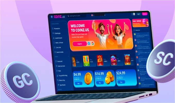
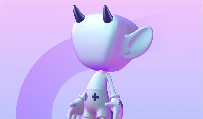
Selected cases
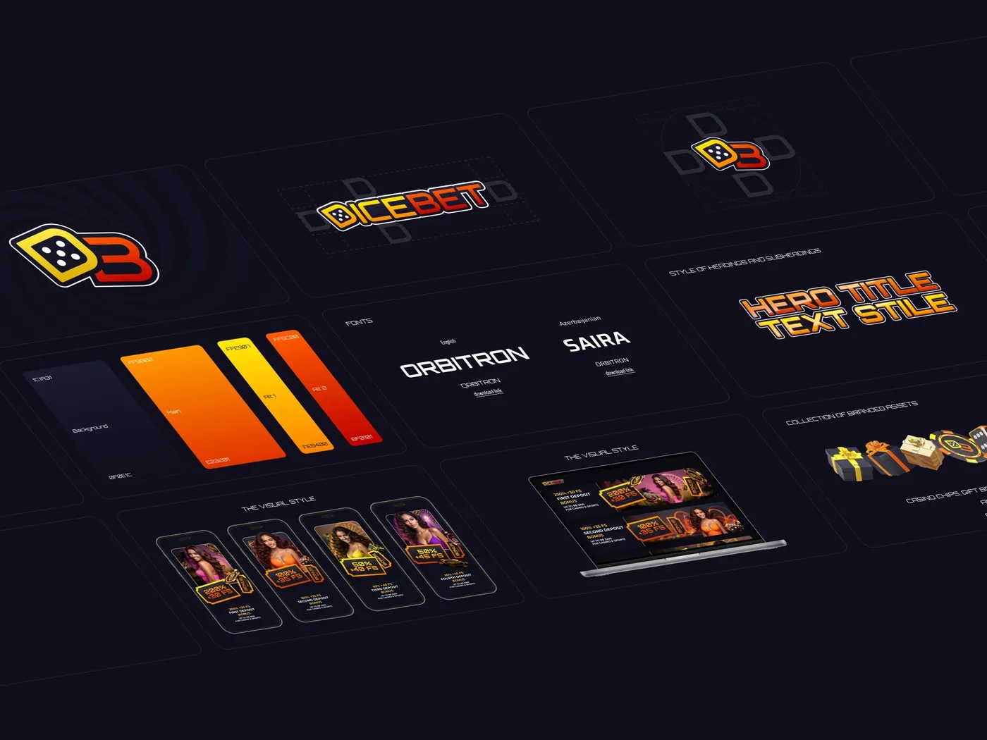
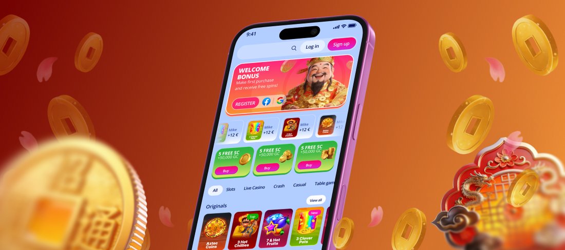
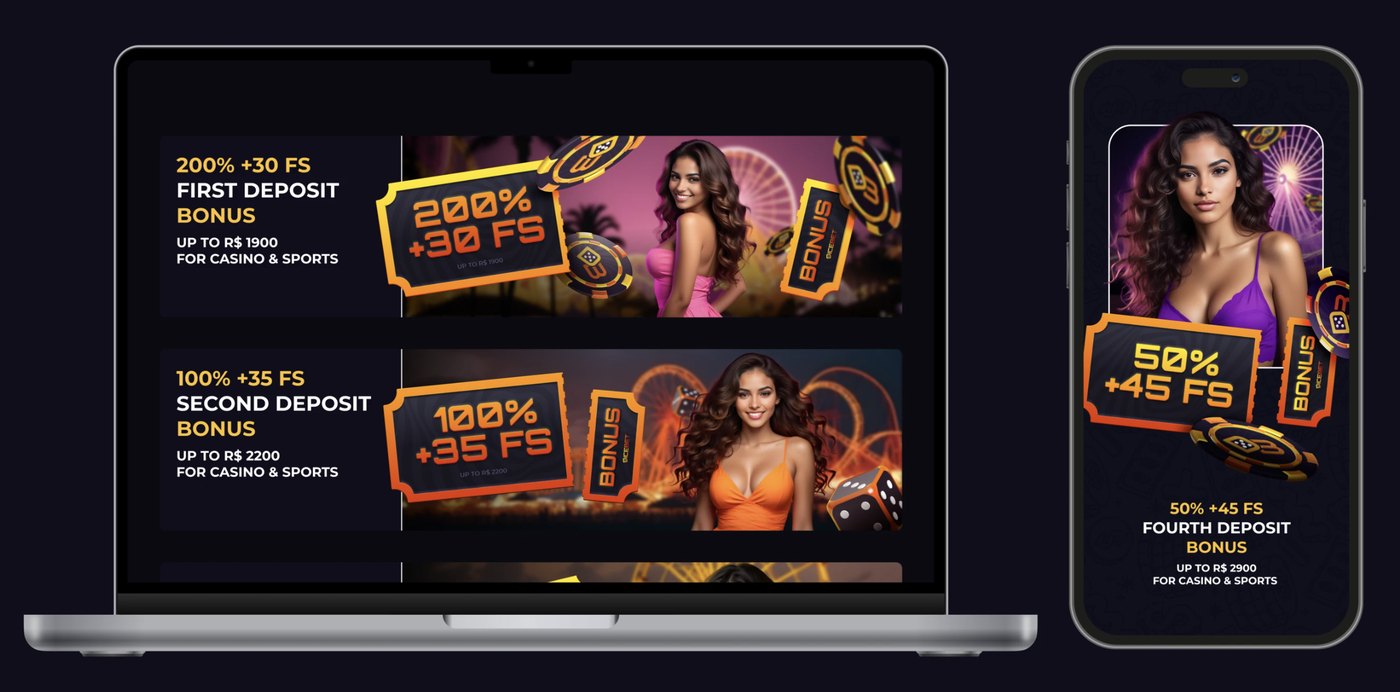
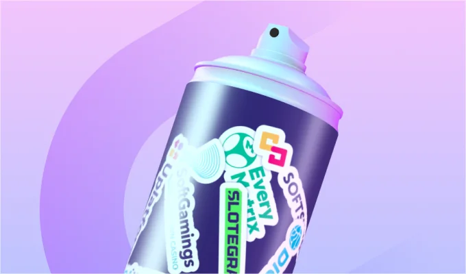
Provably-fair crypto dice brand with 3D mascots and social visuals.
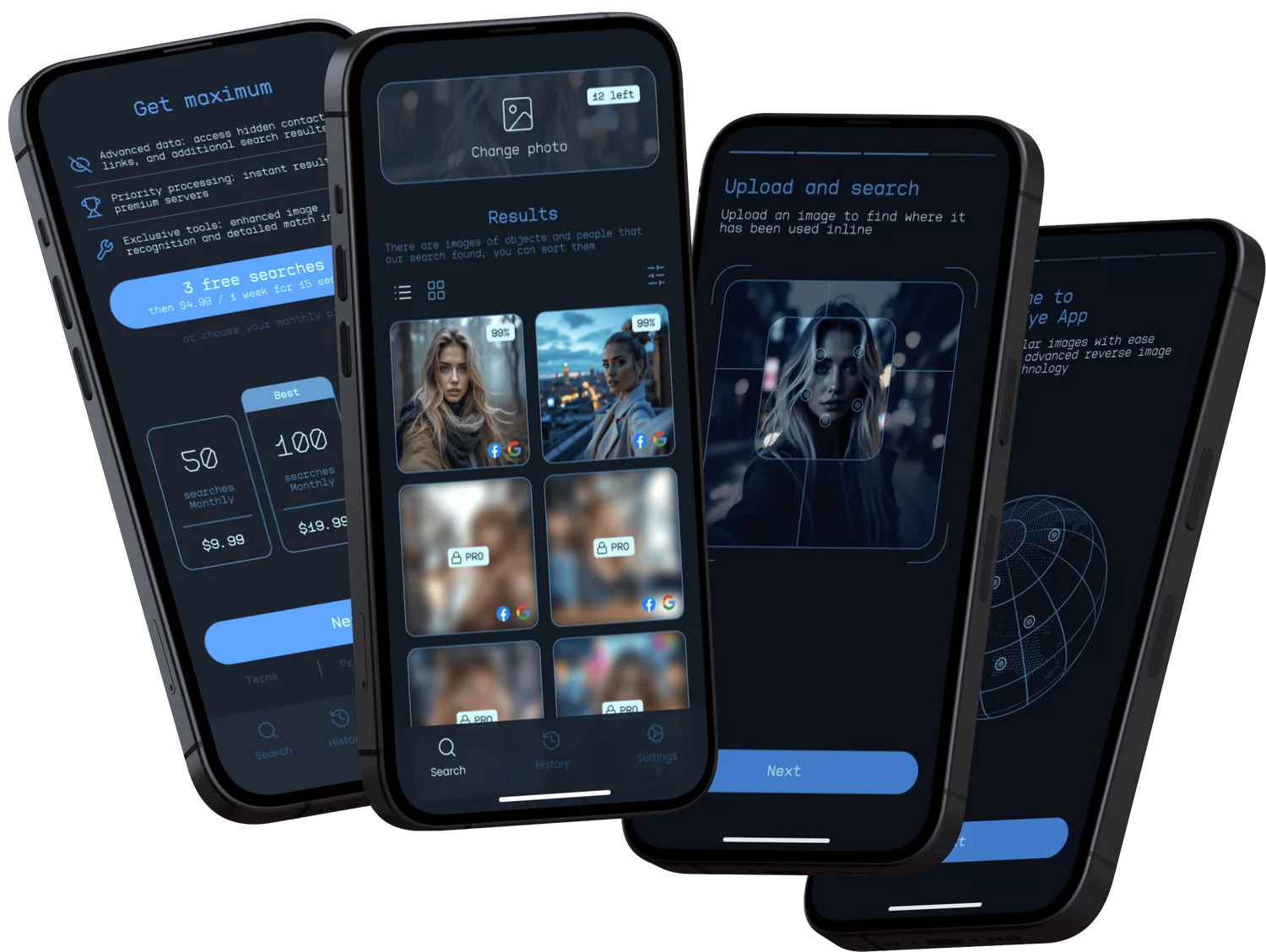
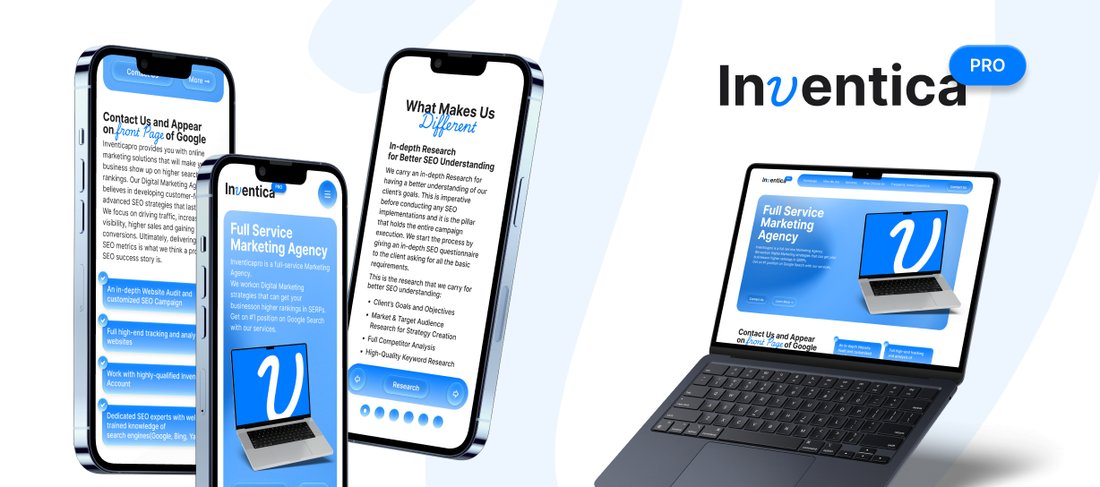
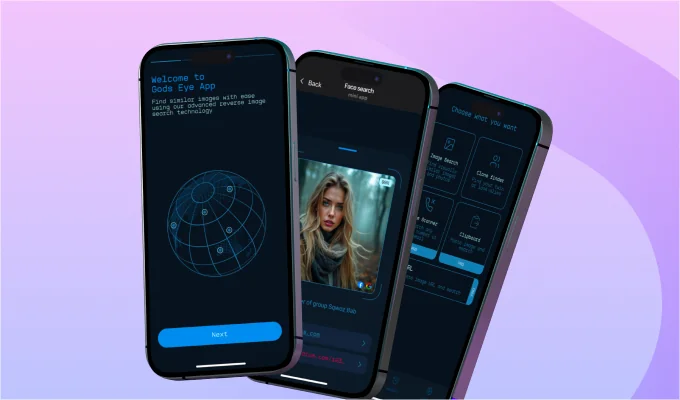
Reverse image search app with clean upload, match and results flows.
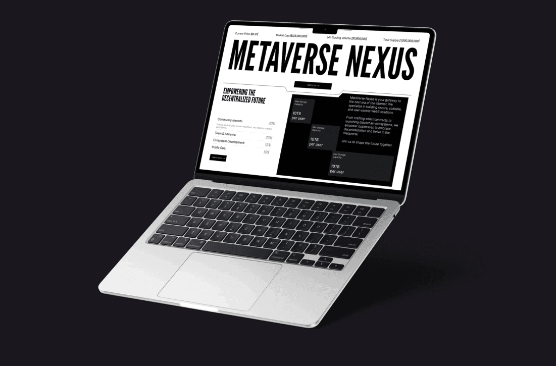
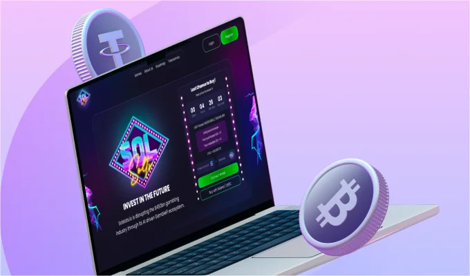
Web3 ecosystem website with tokenomics, staking and a brand story.
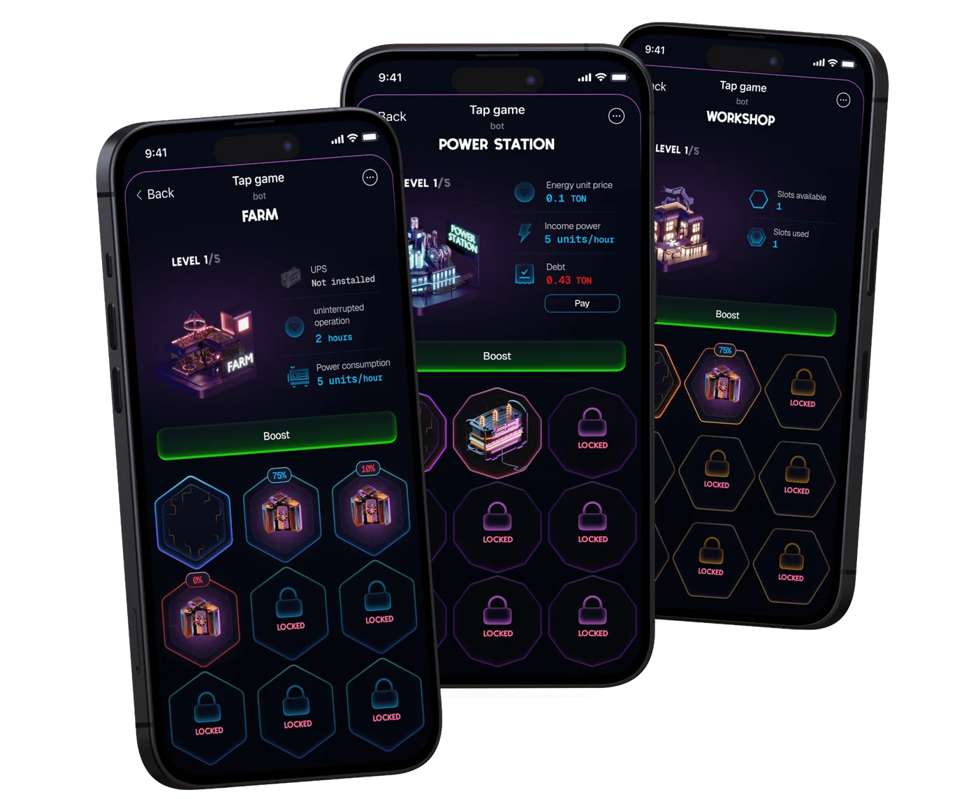
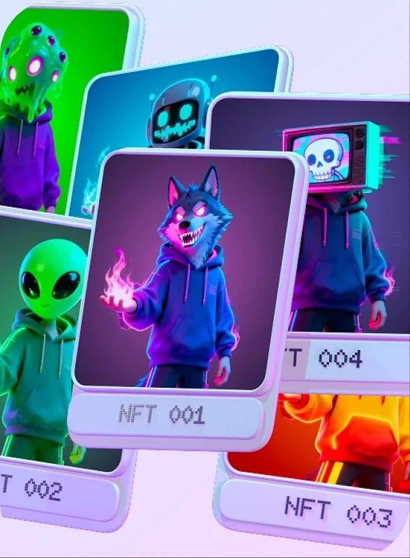
Telegram mini-app tap-to-earn game with 3D assets and a live economy.
Themed lobby with a strong illustrated identity and motion design.
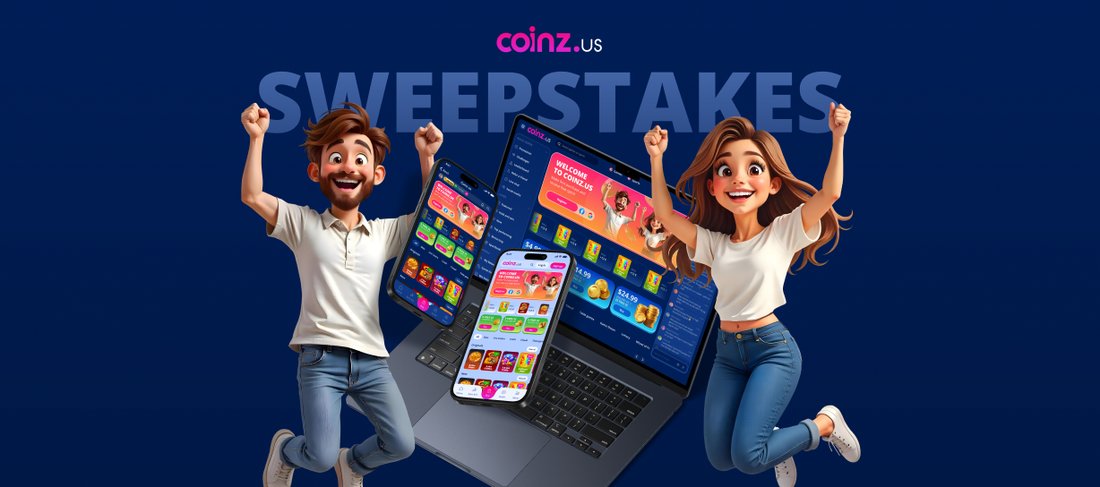
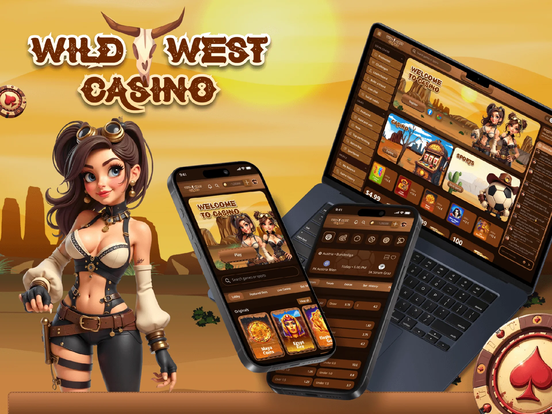
Crypto-native iGaming brand with dual-currency product UX and a coin mascot.
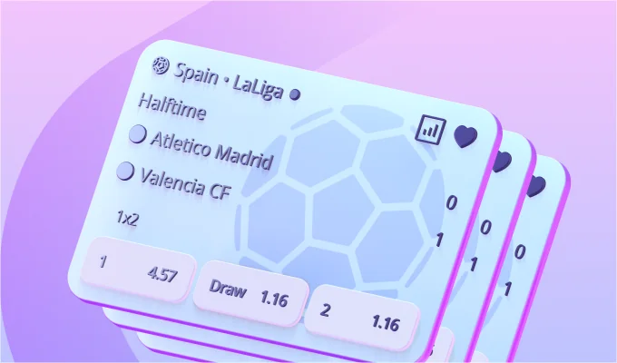
Mobile-first sportsbook with live betting and fast bet-slip UX.
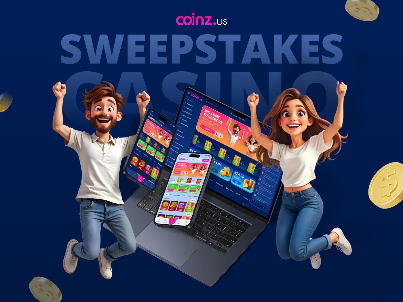
Full platform redesign with multi-language and a dark-mode launch.
Typically 3-6 weeks. Longer for multi-brand platforms or full guideline books.
Yes. Illustration direction and a starter library are part of most projects.
Yes. Brand tokens map cleanly into product UI tokens.
Logo system, colour and type, illustration, guidelines doc, full asset kit, source files.
More from the studio
 Turnkey Template
Ready-to-launch iGaming and sportsbook UI for fast brand customisation.
 Sweepstakes Platforms
Custom UI for sweepstakes platforms with dual-currency UX.
 Platform Customization
UI upgrades and branding for existing iGaming platforms.
 Sportsbook & Betting
Modern sportsbook interfaces for real-time betting.
 Web3
Web3Design for crypto platforms, token projects and Web3 ecosystems.
 NFT & Gamification
Collectible assets and gamified visuals for engagement.
 Product & UI/UX
Intuitive product interfaces focused on usability and scale.
 Apps
AppsUser-friendly mobile and web apps for modern products.
 Conversion Landing Pages
High-converting pages for launches and campaigns.
 3D, Motion & Visuals
High-quality 3D visuals and motion for products and marketing.
 Mascots & Characters
Unique characters that strengthen brand identity.
ClefDev is a branding agency that builds complete brand identity systems for digital products: logo systems, colour palettes, typography, iconography, brand voice and guidelines your team will actually use. We create market-specific branding for the EU, US, Asia and LATAM, adapting tone, colour psychology and naming to each region without fracturing the core identity. From startup launches to full rebranding services for established operators, every identity is engineered to work hard across product UI, marketing and motion. The result is brand identity design that stays consistent from app icon to billboard.
ClefDev builds brands that are born for screens. As a branding agency working mostly with SaaS, iGaming, fintech and Web3 companies, we design identities that survive contact with real products: tiny favicons, dark-mode dashboards, app store listings and animated logo stings. Strategy comes first; positioning, audience and competitive mapping define what the brand must communicate before any visual exploration begins.
A single mark is not enough for a modern product. We design logo systems: a primary mark, secondary lockups, monograms, app icons and responsive variants that hold up from 16 pixels to stadium screens. Each system ships with clearspace rules, minimum sizes, misuse examples and files in every format your team and partners will ever ask for, from SVG to print-ready vectors.
The visual core of every identity is a working toolkit, not a mood board. We define colour palettes with accessibility-checked contrast pairs and dark and light mode mappings, select or pair typefaces with full licensing guidance, and draw custom iconography that matches the construction of the logo itself. Because we also build interfaces, every choice is stress-tested in real UI before sign-off; our UI/UX design team inherits these tokens directly.
How a brand sounds matters as much as how it looks. We define tone-of-voice principles, vocabulary, naming conventions for products and features, and example copy across touchpoints: website headlines, UX microcopy, support messages and social posts. The voice work plugs straight into your marketing and product teams, keeping a casino brand playful where it should be and compliant where it must be.
Guidelines are only useful if people open them. We deliver brand guidelines as a concise, searchable document built for daily reference, covering:
Colours, symbols and tone read differently across markets, and what converts in Germany can fall flat in Brazil. ClefDev designs market-specific branding: regional palette and imagery adaptations, localisation-ready typography with broad script support, and tone adjustments per market, all governed by one master identity. For iGaming and sweepstakes operators entering new jurisdictions, we align brand assets with local regulatory expectations from day one, so compliance reviews never force a late redesign.
Rebranding is surgery, not decoration. Our rebranding services start with an equity audit to identify what your audience actually recognises and values, then evolve the identity around those anchors. We manage the full rollout: asset migration maps, transition guidelines and refreshed templates, so the switch lands cleanly across product, advertising and app stores. If your brand needs a character to front it, our mascot design team builds one that fits the new system natively.
Most branding agencies hand over a PDF and disappear. ClefDev stays through implementation: we apply the new identity to your website, product UI and motion assets, including animated logo reveals from our 3D and motion team. Engagements are fixed-scope with clear deliverables, typically three to six weeks for a full identity system. Book a discovery call and get an honest audit of your current brand before committing to anything.