McLaren's Rebrand Is a Brand Architecture Lesson
On September 22, McLaren showed a new wordmark. All caps, a custom typeface Carscoops identifies as McLaren Sans, and a short line under the C. The shape comes from a 1920s sign above the family service station in Remuera, Auckland, where Bruce McLaren built his first racing car. It's a good story. The more useful part, if you run a brand with more than one product, is the scope: one identity now covers McLaren Racing and McLaren Automotive, two businesses that no longer share an owner.

Two companies, one wordmark
In April 2025, Abu Dhabi's CYVN Holdings completed its purchase of McLaren Automotive. It merged the car company with the British startup Forseven under a new McLaren Group Holdings and took only a minority stake in McLaren Racing. So the road-car business and the race team now sit with different owners and chase different customers. One sells supercars and, soon, an SUV. The other sells sponsorship deals and a lot of papaya merchandise.
McLaren's release says the new identity spans Formula 1, IndyCar, its World Endurance Championship programme and the road-car side. The quotes come from two executives on two payrolls: David Woodhouse, chief creative officer at McLaren Automotive, and Lou McEwen, chief marketing officer at McLaren Racing. That tells you how the project ran. Neither company got to own the brand alone, and both signed the same page.
What they kept and what they changed
McLaren rebuilt the wordmark and left the symbols where they were. The Speedmark stays at the centre. The Speedy Kiwi, the nod to Bruce McLaren's New Zealand roots, stays too. Papaya is still the primary colour.
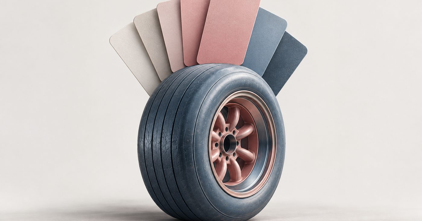
The palette got wider. Carscoops lists seven colours taken from a photograph of Bruce McLaren: Papaya, Ember, Midnight, Black, Anthracite, Colnbrook and Mist.
For an old brand, this is the right order of operations. Recognition lives in the symbol and the colour. People spot a papaya car long before they read anything on it. The wordmark is the part people read least, so it is the cheapest place to make a visible change. A new typeface plus a heritage story gives the press a headline while the assets people actually recognise stay put. A simple all-caps mark also holds up better at small sizes, on an app icon or an embroidered cuff, and this brand lives on merchandise.
The extra colours do real work, too. One hero colour is great on a race car and awkward on a configurator page, a hospitality menu or an investor deck. A set of darks and neutrals (Midnight, Anthracite, Colnbrook, Mist) lets each business set its own tone without inventing its own colours. That is how brand drift usually starts: a team needs a dark background, nobody gave them one, so they pick a navy.
Why the timing matters
PMW lists what else is going on at McLaren right now. A £500 million investment programme in UK manufacturing and engineering. A planned SUV that takes the company past two-seat sports cars. The team's 1000th Formula 1 Grand Prix. A Hypercar entry in WEC.
That is a lot of new surface arriving at once. New product categories are where brands tend to split, because each launch team builds its own look against a deadline. Setting the system first means the SUV launch inherits rules instead of writing them.
Carscoops says the rollout will be gradual across future cars, merchandise and digital material. That is realistic. A rebrand announced in one day takes years to reach every touchpoint, and the stragglers (an old app screen, a dealer site, last season's jacket) are where customers notice the seams.
What multi-product brands can copy
We see the McLaren problem at a smaller scale all the time. A crypto casino adds a sportsbook. An exchange ships a wallet, then a card. A fintech app spins out a business product with its own team. Each one starts with a logo tweak and a colour "just for this product." Two years later the company has four brands that look related the way cousins do.
The cost shows up in places founders rarely check. Ads for the new product get their own creative style, so retargeting stops feeling like the same company. The help centre picks a third palette. A player who already trusts the casino gets no visual cue that the sportsbook belongs to the same operator, so the trust you earned doesn't carry over. In regulated markets that trust is most of what you have, because you can't out-bonus everyone.
The fix is brand architecture decided early. Which assets are fixed across every product, which ones each product can flex, and who signs off on exceptions. McLaren's answer is easy to borrow. Lock the symbol and the primary colour. Share one wordmark. Give every team a wider palette so nobody has to improvise one. If you are about to launch a second product under the same name, that decision belongs in the brand identity work before anyone designs the first launch page for it.
Write the reason down as well. McLaren's reason is a sign over a garage in Auckland. Yours doesn't need to be that romantic. But a new wordmark with no story behind it reads as a font change, and teams treat font changes as optional.
The takeaway
Rebrands get judged on the logo. McLaren's is more interesting for the org chart it had to cover: two companies, two sets of owners, one set of rules. If your product line is about to grow, agree on those rules before the next launch, while there is still only one version of your brand to protect.
Sources
- McLaren, "McLaren marks the next chapter with the reveal of an evolved identity", September 22, 2026mclaren.com
- Carscoops, "McLaren's New Logo Is Inspired By An Old Garage Sign", September 22, 2026carscoops.com
- Professional Motorsport World, "McLaren unveils unified brand identity across Racing and Automotive", September 23, 2026pmw-magazine.com
- Just Auto, "CYVN Holdings completes McLaren Automotive buy", April 7, 2025just-auto.com
ClefDev Studio
We are a design studio working with iGaming, Web3 and fintech brands. Notes from the studio are written by the people working on the projects, not by a content team.