iOS 27 Just Ended the Liquid Glass Opt-Out
Apple ships iOS 27 today, Monday, September 14, at around 10 a.m. Pacific. The headlines are Siri and the speed numbers. For anyone who runs a mobile product, the line that matters is buried in the developer documentation: the key that let apps skip Liquid Glass for the past year is now ignored. Build against the iOS 27 SDK and your app gets the glass, whether you designed for it or not.
The loan came due
When Liquid Glass arrived with iOS 26, Apple gave developers an escape hatch. One Info.plist key, UIDesignRequiresCompatibility, told the system to render the app the way it looked when built against the older SDK. Apple's documentation described it as something to use "temporarily" while "reviewing and refining your app's UI for the design in the latest SDKs." A lot of teams read temporarily as "until we get around to it." That reading expired. The same documentation page now says the system ignores the key when you build for iOS 27 or later. On September 9, Apple's developer news added the other half of the deadline: starting April 2027, every iOS and iPadOS app uploaded to App Store Connect must be built with the iOS 27 SDK or later. You can keep shipping on the old SDK for roughly seven more months. After that, every update you submit carries Liquid Glass and no key will stop it. Seven months sounds generous. For a casino app with dozens of screens or a wallet with regulated disclosure flows, it is one release cycle plus QA.
What changed in the glass
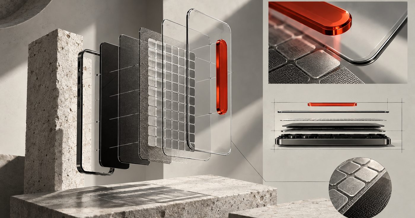
iOS 27's Liquid Glass is better than the iOS 26 version, which is partly why Apple is comfortable making it mandatory. Apple's stated goal for the changes it showed at WWDC in June was readability. The glass now diffuses complex content more aggressively. Glass elements got a darkened edge and brighter specular highlights, so controls read as objects instead of smudges. When content scrolls under a floating bar, a uniform toolbar appears across the top to keep the text legible. The bigger change is that the user gets a dial. A slider in Settings runs from ultra clear to fully tinted. So there is no longer one Liquid Glass to design against; your app has to hold up across the whole range. A lobby that looks fine at the default may fall apart at ultra clear, where game thumbnails bleed straight through the tab bar. At fully tinted, the brand tint you picked may fight the system's. Apple also says existing apps gain many of these improvements automatically on iOS 27, without a recompile. True, and a little dangerous: your app looks different to users from today, and nobody on your team tested that.
The screens that break first
We design for iGaming, fintech and Web3 products, and the same screens fail whenever a platform changes its chrome. The first is any dense grid under a floating bar. A casino lobby is a wall of saturated game tiles. Put a translucent tab bar on top and the bar picks up whatever colour is scrolling underneath. Apple's new diffusion helps, but the fix is on your side: give the bar a stable surface, or accept that the top row lives behind glass and art-direct the tiles for it. The second is any number the user acts on. A balance or an odds line needs contrast that holds at every point on the transparency slider, and under Reduce Transparency and Increase Contrast, both of which Liquid Glass now respects. If your type system has one weight and one colour for money, it needs a second. The third is custom chrome. Many products replaced the system tab bar years ago with a branded one. Those components do not inherit the new glass, so they now sit beside system elements that do, and the mismatch shows. Either rebuild on the system components or commit to a fully custom chrome that looks deliberate next to them. Then there are icons. Apple says iOS 27 icons are sharper and more detailed, with refraction effects that can be applied selectively, and Icon Composer now builds icons from multiple layers of glass. A flat PNG dropped into that system looks like an app that stopped updating in 2024. The icon is also where the brand meets the home screen, so this is a branding job as much as a UI job.
The App Store page is a design project too
A second deadline rides along with this release. Since August 5, Apple has been telling developers that the App Store gets new creative assets this fall: a product page header, search result assets and richer In-App Event visuals that can show the brand instead of only screenshots. Apple published Figma, Photoshop and Pixelmator templates for them, and the September 9 note says a product page preview tool is coming to App Store Connect so you can see the page before it goes live. For a regulated product the page is often the first thing a compliance reviewer or a payment partner opens. A header that puts the brand, the game art and the licence context in one frame deserves a proper design pass, not an export from the last pitch deck.
How fast your users will move
If you are hoping most users stay on iOS 26 for a while, Apple's own numbers say no. As of June 7, 2026, 79 percent of all iPhones that transacted on the App Store were running iOS 26, and 86 percent of iPhones released in the previous four years. iOS 27 supports every iPhone back to the iPhone 11, so the device base is not the brake it used to be. Expect most of your iOS audience on the new glass by the end of the year, before the April cutoff forces your hand.
What we would do this week
Install iOS 27 on a test device today and open your app at both ends of the transparency slider. Screenshot every screen where a floating bar sits over content, and every screen with a number the user acts on. Sort them into three piles: fine, fixable with tokens, and needs a redesign. In the apps we have looked at, most screens land in the first pile and the ones that make money land in the third. Then decide whether the redesign is a port or a rethink. A port keeps your information architecture and swaps the chrome. A rethink asks whether the layered, floating model of Liquid Glass changes how you would structure the lobby or the wallet if you were starting today. For most products the honest answer is a port with a handful of rethought screens, which is a scoped project with a known end date. If you want help scoping it, that is what our mobile app design team does most weeks. The compatibility key bought a year, and spending it on other things was a reasonable call. That year is over. Budget the port now, do it before April makes the choice for you, and treat the icon and the store page as part of the same job.
Sources
1. Apple Developer, "App Store submissions now open for the latest OS releases", September 9, 2026
2. Apple Developer Documentation, "UIDesignRequiresCompatibility"
3. Apple Developer, "App Store" support page, "iOS and iPadOS usage" as measured June 7, 2026
4. Apple Developer, "Get ready for new creative assets on the App Store", August 5, 2026
5. MacRumors, "Here's How Liquid Glass Is Changing in iOS 27", June 10, 2026
6. MacRumors, "iOS 27: Release Date, New Features, and Compatible iPhones", September 13, 2026
Need a partner who tracks this stuff?
We build for the markets and rails ahead of the curve.
Talk to us